UX Case Study · 2026

Sainsbury's Shopper Handset

A UX redesign of the handheld picking interface used by Sainsbury's online shoppers, grounded in three years of personal use as a shopper.

Role

Solo project - research, design, prototyping, testing

Timeline

May-June 2026 (~2 weeks)

Tools

Figma

Outcome

Annotated redesign, clickable prototype, validated with usability testing

The system, the user, the conditions

From the customer ordering their groceries online to a Sainsbury's online shopper walking the store and pulling items from shelves, the shopper handset is a crucial component of their job. Love it or hate it, the shopper constantly glances at it for four hours straight each shift and uses it to navigate, scan, confirm, and handle items relating to the customer's order. At my store, shoppers are expected to pick 198 items per hour - known as IPH. Across a four-hour shift, that's around 800 items. All of this happens while moving through the store and handling items from chilled and frozen sections, where workers wear gloves that often leave their touchscreen-based handsets uncooperative. Bad design here doesn't just mean a worse user experience - it means missed store targets, frustrated workers, and customers receiving the wrong items.

Three years as a shopper, structured as research

The research base for this project is slightly different from the standard UX brief: I worked as a Sainsbury's online shopper for three years, using the handset across every shift. This is autoethnography - a recognised qualitative method that prioritises sustained immersion in a context over external observation. Three years of daily use means specific, lived knowledge of where the interface fails. I have firsthand experience of the touchscreen not cooperating when I'm wearing gloves. I have firsthand experience of menus slowing me down when I have 198 items to pick in an hour. I have firsthand experience of having no way to tell, mid-shift, whether I'm on target. That immersion is the foundation on which the rest of this project is built.

Three years of observations alone aren't research - they had to be structured. I synthesised the findings into six themes:

I focused on the three themes with the most direct interface leverage: interaction friction, feedback, and physical/ergonomic context. The others - system-reality mismatch, error recovery, and onboarding - are real findings that surfaced in the synthesis but were treated as out of scope for this redesign.

What this research base doesn't include: formal interviews with current colleagues, which were out of scope for this project. Online searches for shopper-handset discussion didn't surface meaningful material. The findings here therefore rest on autoethnography supplemented by the years of informal colleague feedback that accumulated alongside it.

What the shopper uses today

Three flows were chosen for detailed examination: the main scan screen (where shoppers spend most of their shift), the multi-quantity confirmation flow, and the substitution flow. Each was reconstructed from memory, with one screen verified against a reference photo of the real handset - the now well-known Weetabix-name-with-peas-image mismatch, captured during a real shift. Each annotated screen identifies specific findings tied to specific UI elements.

Main scan flow

Of the three flows, the main scan screen carries the most traffic - shoppers spend most of their shift on it. The findings cluster across feedback and information design. Real-time IPH isn't shown anywhere; shoppers either wait for the end-of-shift review or navigate through menus mid-shift, which itself costs IPH. The progress bar shows proportion only, with no absolute numbers - 50% means very different things on a 60-item versus 200-item order. Product imagery is often out of date: the captured screen here shows 'Weetabix 24's' alongside an image of frozen peas. Several other findings - including next-item information and touchscreen-only interaction - are visible in the annotation.

Annotated current state of the Main Scan screen, showing findings tied to specific UI elements: missing IPH, abstract progress bar, outdated product imagery (Weetabix name with peas image), location-only next item, touchscreen-only interaction.

Multi-quantity confirmation

Multi-quantity picks force the shopper through a separate Confirm Quantity screen, requiring an on-screen tap to advance. Across the 800+ picks of an average shift, the redundancy compounds - at a 198 IPH target, every second of friction matters.

Annotated current state of the Quantity Confirmation flow, showing the separate Confirm Quantity screen that multi-quantity picks force shoppers through.

Substitution flow

The substitution flow has four findings, two of which stand out. The 'No Sub' button - for cases where no suggestion is suitable - only appears at suggestion 5/5, forcing the shopper to page through all five suggestions before being able to decline. The Target badge present on the standard Confirm Quantity screen is missing on the substitution version, removing target context when the shopper most needs to verify against it. Suggestion logic also frequently doesn't reflect actual store stock - a data problem the interface could potentially mitigate. The remaining finding is visible in the annotation.

Annotated current state of the Substitution flow, showing findings including the No Sub button gated behind suggestion 5/5 and missing Target context on the substitution Confirm Quantity screen.

How the redesign thinks

The redesign covers all three flows examined above. Five decisions in particular are worth explaining in detail - they span layout, hardware integration, deliberate restraint, systems-level thinking, and smaller interaction tweaks. Design choices are only as strong as the reasoning behind them. The decisions here are explained not because the screens speak for themselves but because they don't - every move involved a trade-off worth articulating. Other moves are documented in the Figma file, but these five best demonstrate how the redesign thinks.

1. IPH replaces the timestamp

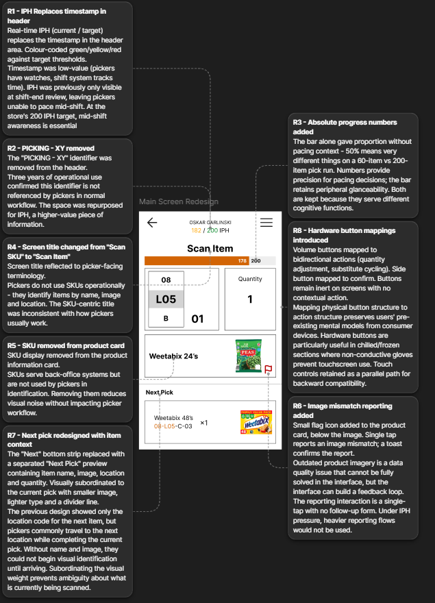
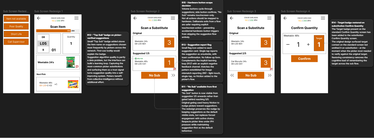
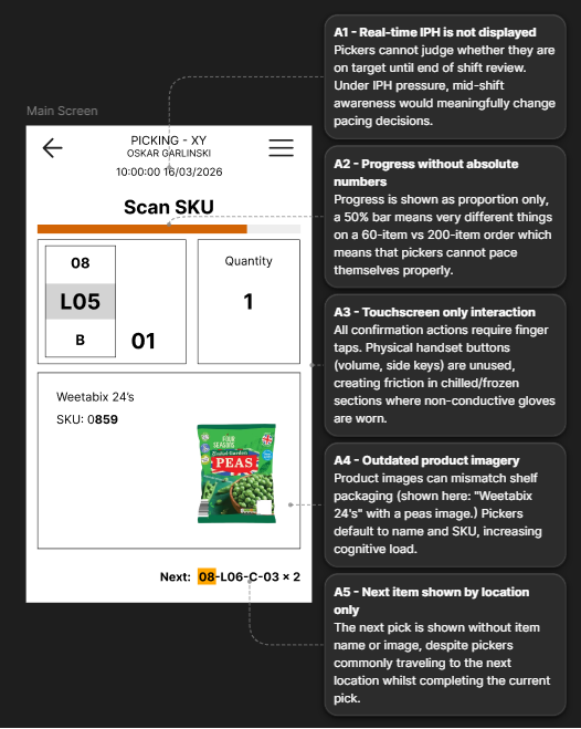
The header previously showed the shopper's ID, name, and a timestamp. The name stays - handsets need to be traceable to a shopper if left somewhere - but the ID and timestamp go. The name handles traceability on its own; the ID was redundant. Shoppers have watches and the shift system tracks time, so the timestamp was occupying header real estate without earning it. In its place, the redesign surfaces real-time IPH - the shopper's current pace against their target - colour-coded against threshold bands so it can be read at a glance without doing mental maths.

The previous system showed IPH only at shift-end review, or via menu navigation mid-shift. That created a self-defeating loop: checking IPH cost IPH. Surfacing the number persistently on the header eliminates the loop - shoppers can glance at it against their 198 target without leaving the main scan screen.

Redesigned Main Scan header showing the persistent real-time IPH indicator, colour-coded against the shopper's target.

2. Hardware buttons mapped to actions

Across the original flows, all confirmation actions require an on-screen tap. This causes two specific problems: capacitive touchscreens don't respond to the non-conductive gloves shoppers wear in chilled and frozen sections, and the most frequent interactions (quantity confirmation, suggestion cycling) compound friction across hundreds of picks per shift. The redesign maps these actions to the device's existing hardware buttons. Volume up and down - which sit as a paired bidirectional control - handle bidirectional actions: adjusting quantity, cycling between substitution suggestions. The side button - a unitary distinct control - handles the unitary deliberate action of confirming a pick. Mapping affordances to actions preserves the shopper's existing mental model from every other device they own; the buttons do what they look like they should do. Touch remains as a parallel path. One action deliberately stays touchscreen-only: 'No Sub.' Exit or destructive actions are safer requiring explicit touch interaction - a hardware-button shortcut here would be too easy to trigger accidentally.

Redesigned Quantity Confirm screen with annotation showing the hardware button mapping: volume buttons adjust quantity, side button confirms.

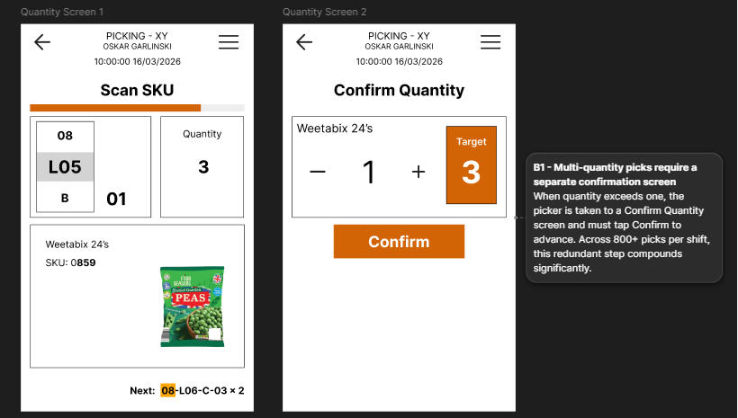
3. Restraint on the Confirm Quantity screen

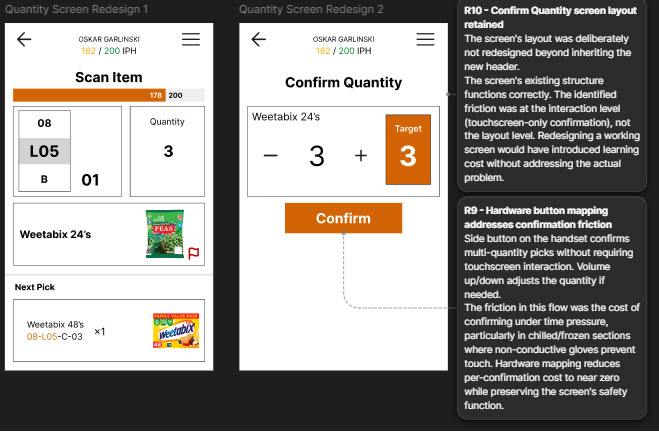
One alternative considered was eliminating the Confirm Quantity screen entirely - letting multi-quantity confirmations happen in-place on the main scan screen. This was rejected. The screen exists as a safety check at the point where errors are most costly: multi-quantity picks have no recovery path in the original system without manager intervention. Removing the screen would remove the check. The redesign instead addresses the underlying friction - the touchscreen tap under time pressure - by mapping the confirm action to the side hardware button. The screen stays; the cost of confirming on it approaches zero. Restraint is its own design decision; knowing what not to redesign is part of the job.

4. Top Sub badge - turning suggestions into a learning loop

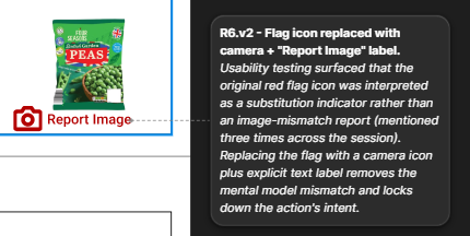
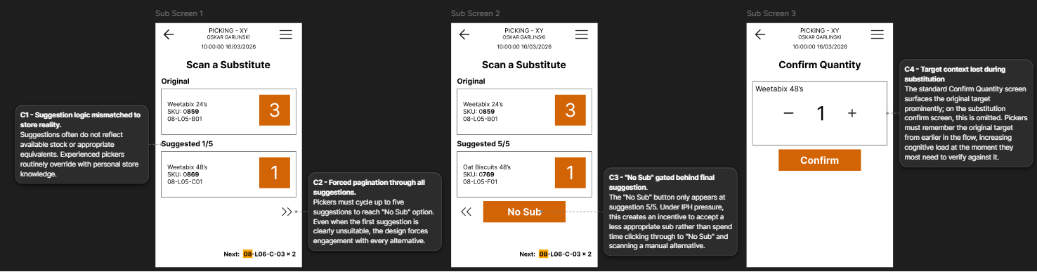
Suggestion quality is partly a data problem. The algorithm's recommendations often don't reflect actual store stock or appropriate equivalents - a finding documented above and reinforced by shopper behaviour (experienced shoppers routinely ignore the suggestions and use store knowledge instead). The interface can't fix the algorithm directly, but it can build a feedback loop. A small 'Top Sub' badge appears beside suggestions that match what shoppers across the network actually pick as substitutes - implicit positive signal aggregated from real behaviour. A small report flag on each suggestion handles explicit negative signal: 'this suggestion is wrong.' Together, they turn the suggestion screen from a static display of algorithmic guesses into a learning system that improves over time. The 'Top Sub' label uses domain language - shoppers already say 'sub' for substitute - rather than abstract UX terms; the badge signals the system understands the work.

Redesigned Substitution screen showing the Top Sub badge beside suggestions chosen most frequently by shoppers across the network, plus the report flag for explicit negative feedback.

5. "No Sub" always visible

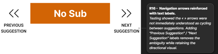
In the original system, the 'No Sub' button only appears at the final suggestion (5/5), forcing shoppers to page through all five suggestions before being able to decline. The redesign makes 'No Sub' visible from suggestion 1/5 onwards. The original gating presumably exists to nudge shoppers toward finding a substitute rather than leaving customers without a replacement - a defensible business goal. The redesign preserves that nudge by keeping suggestions as the default visible state: the shopper sees suggestion 1/5 immediately on entering the flow and must actively tap 'No Sub' to opt out rather than defaulting to it. The friction shifts from forced engagement to active choice. Same direction of nudge, lower cost on the shopper's time.

Wired and walkable

A clickable Figma prototype walks through all three redesigned flows. One limitation worth naming up front: a clickable prototype cannot simulate hardware button interaction. The Quantity Confirm flow's core redesign - mapping the side button and volume buttons to confirmation and quantity adjustment - exists in the design but can't be tested in this medium. Full validation would require deployment on actual handset hardware. The prototype is therefore best read as a walkthrough of the touchscreen path, with the hardware mapping documented above.

Open clickable prototype →

What the shopper actually thought

A single-participant validation session was conducted with a former Sainsbury's shopper, recorded over 16 minutes. Four tasks were given, ordered to test discoverability (where would you find this?) before action (how would you complete this?). The ordering preserves the participant's pre-interaction perception of the screen - discoverability data is sharpest before the screen becomes a tool. Two limitations worth naming up front: n=1 means findings are directional rather than statistically representative, and the participant is a former rather than current shopper. I also led the participant once during the session, explaining the hardware button concept during a task rather than letting it surface unprompted. In synthesis I weighted unprompted comments more heavily than in-task agreement, but the moment is worth flagging.

What landed

Three design decisions were validated during the session: the IPH placement, the Next Pick redesign, and the hardware button mapping. The strongest validation came as a second-order insight the participant articulated unprompted - that checking IPH in the current system itself costs IPH. The persistent header indicator doesn't just save time; it eliminates a self-defeating loop. That framing wasn't in the original design rationale, but the participant named it independently.

"You don't have to go out your way to check your IPH, which also then takes away, you know, your IPH by you wasting time checking it."

Participant - on the persistent IPH indicator

The participant's framing is sharper than the one in the original design rationale. The persistent IPH indicator doesn't just save a few seconds per check - it eliminates a structural loop where the only way to know your pace was to interrupt it.

"It's at the bottom, right? That's where I'm seeing it. Makes sense. Straight at the bottom where you expect it… exactly what I said."

Participant - on the redesigned Next Pick section

Before seeing the screen, the participant had named the information they'd want before walking to the next pick - name, image, location, quantity. The redesign surfaced exactly that, exactly where they expected to find it.

What needed iteration

Two findings drove iteration: the image-mismatch flag icon was misinterpreted as a substitution indicator, and the suggestion-cycling arrows weren't immediately recognisable as navigation cues. The flag was the stronger signal - the participant returned to it three separate times across the session, each time framing it as an item-state marker rather than an action. The mental model mismatch was clean: in a shopper context, a flag reads as 'this item is flagged' (a property of the item) rather than 'report this image' (an action on the image).

"That red flag is a bit confusing. I'm not sure what that is for… I thought that's like a flag this, like this is not here type thing."

Participant - on the original flag icon

The flag was replaced with a camera icon - semantically closer to "image" than to the generic "flagged item" reading the participant gave it. A "Report Image" text label sits beneath the icon to remove any remaining ambiguity. The icon now signals what the action is about; the label signals what it does.

v1 - As tested

Original (v1) flag icon as tested - misinterpreted by the participant as a substitution indicator.

v2 - After iteration

Iterated (v2) camera icon with explicit Report Image text label.

The second iteration addressed the substitution-cycling arrows. The participant figured the arrows out eventually but only after engaging with them - the «» symbols weren't immediately readable as "previous/next suggestion." Text labels ("Previous Suggestion" / "Next Suggestion") were added beneath each arrow. The backward arrow now appears only when there's a previous suggestion to return to, preserving the contextual logic.

v1 - As tested

Original (v1) substitution navigation arrows - not initially recognised as suggestion cycling.

v2 - After iteration

Iterated (v2) substitution navigation arrows with Previous Suggestion and Next Suggestion labels.

What the participant added that I hadn't designed for

One additional finding came from the participant volunteering an alternative design idea rather than reacting to the one tested. When working through the Quantity Confirm flow, they proposed scanning the same item multiple times to increment quantity, eliminating the confirm screen entirely.

"A good way just to scan it twice… like a single scan is plus one."

Participant - proposing an alternative to the confirm screen

This is a more radical solution than the redesign took. It would also require separate validation - multiple scans of the same item are currently invalid input in the system, and reworking that behaviour has implications well beyond the quantity flow. I'm documenting it as a user-generated alternative path rather than incorporating it. It's a reminder that participants surface ideas the designer hadn't considered, and the right response to a strong idea isn't always to implement it - sometimes it's to flag it as worth proper exploration in its own right.

What I'd do next, and what I learned

With more time

The most obvious next step is more participants. Single-participant validation surfaces findings but doesn't validate across the variation that exists between shoppers - different stores, different shifts, different experience levels. Three to five additional sessions would meaningfully strengthen the findings.

The hardware button mapping needs deployment on actual handset hardware to validate. The clickable prototype proved the affordance-matching logic on paper, but the real test is whether shoppers reach for the side button under time pressure, with gloves on, in chilled aisles - conditions a Figma prototype can't recreate.

The two feedback loops introduced in the substitution flow - the "Top Sub" badge and the report flag - are designed to improve over time. Evaluating them needs longitudinal data the project timeline couldn't support. Are suggestions actually getting better? Are shoppers using the report flag?

The participant's scan-twice idea also warrants proper exploration as a parallel quantity-confirmation path.

What I take from this

A few things stand out from the work.

Domain knowledge changes what UX research looks like. Three years of immersion as a shopper provided a research base that interviews alone couldn't have produced. Autoethnography isn't the right method for every project, but where it fits, it produces a different kind of finding than external observation does.

Restraint is a design skill. The decision not to redesign the Confirm Quantity screen layout was harder to articulate than the decision to redesign everything else. Knowing what shouldn't change is part of the job.

Hardware-software integration is a UX concern, not just an engineering one. The volume-button mapping was the most interesting move in the redesign because it required thinking about the device as a physical object with affordances, not just a screen with pixels.

Testing humbles the design but also strengthens it. The first version of the flag icon was wrong; the iterated version is better. That loop - design, test, find the gap, iterate - is what the rest of UX work looks like, and it's the loop I most want to keep practising.

Dig deeper